
Meet the 2023 Matilda data visualisation competition winners
Mental illness and substance use are increasingly urgent public health concerns in Australia. Research is abound with the impacts and what can be done about it.
So, how can we go from numbers on a page to getting the public and policymakers to see the big picture?
Visual storytelling can powerfully and effectively communicate complex messages. Providing students with the opportunity to develop and showcase those skills, the Matilda Centre held a competition asking students to identify issues they thought we needed to know about, and to turn that data into a compelling visual narrative.
Judged across three categories – Judge’s Choice, People’s Choice, and Best Beginner, we were thrilled with the quality of the submissions and the stories told.
The 2023 winners were announced on social media in November and are available below.
Judge's Choice: 'The Suicide Epidemic: a data story'
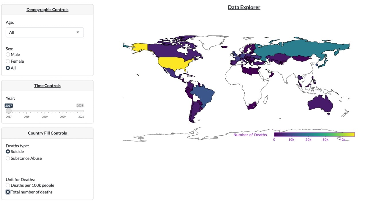
Image: A static version of 'The Suicide Epidemic: a data story.'
The visualisation includes a map of the earth with countries coloured in different rates corresponding to rates of death by suicide. The key highlights include the United States, who are the only country coloured with over 40,000 deaths a year.
Other highlighted countries include Russia with over 20,000 deaths, the United Kingdom and Brazil with over 10,000 deaths a year, and countries within Europe, Australia, Canada, South America, Africa, and several countries in Asia.
The full visualisation allows viewers to adjust the data based on year (from 2017-2021), age and sex demographics, type of death (suicide or substance use), and the comparison of total deaths v deaths per 100,000 people.

By Thomas Elton
Thomas Elton is the winner of the Judge’s Choice award for the submission ‘The Suicide Epidemic: a data story.’
Thomas separated his interactive visualisation into four chapters that progressively explore suicide. The first chapter explores the lives lost from suicide globally, chapters two and three focus specifically on suicide and mental health in Australia. He ends with chapter four which focuses on a case study of the great work that Lifeline does in supporting Australians in crisis.
Learn more about the relationship between suicide and mental health by interacting with the full visualisation.
People's Choice: ‘Music taste and mental wellbeing’
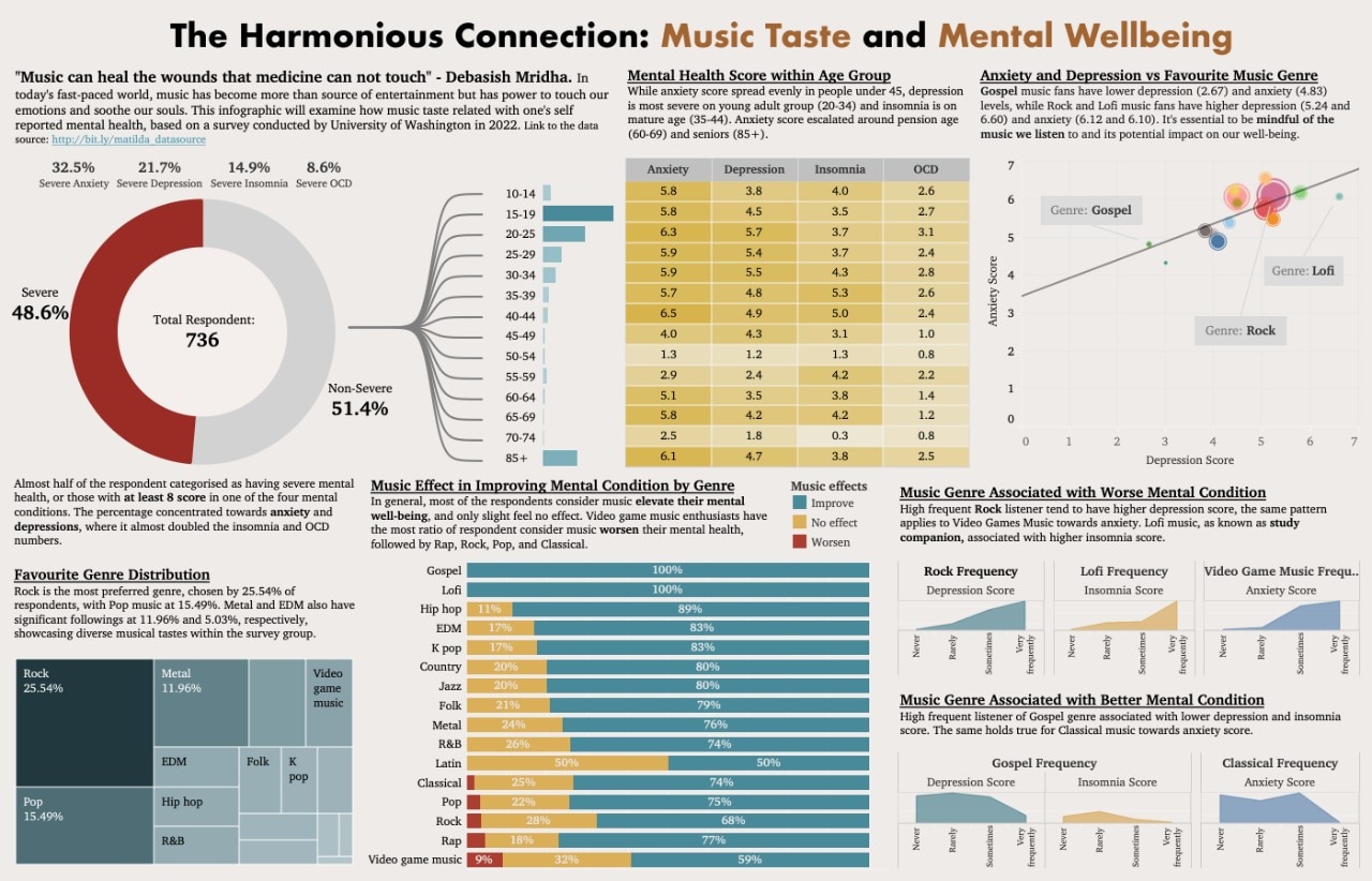
Image: The visualisation of the submission 'Music taste and wellbeing.'
The visualisation shows several different connections between the music we listen to and mental health. Out of 700+ respondents, they found:
- 48.6% self-reported a severe form of mental ill-health
- The highest age groups of mental ill-health being 15-25 year olds and people over 85
- the Gospel genre was associated with lower levels of mental ill-health, with Rock and Lofi associated with higher levels of self-reported depression and anxiety
- Most popular genres included Rock (25.54%), Pop (15.49%), and Metal (11.96%)
- Listening to music overwhelmingly supported improvement in mental health, but Lofi and Gospel were 100% improvement in self-reporting. Video Game Music had the least effect with 9% reporting it made their symptoms worse
- Rock, Lofi and Video Game Music coincided with higher rates of depression, insomnia and anxiety
- Gospel and Classical coincided with lower rates of depression, insomnia and anxiety.
The full visualisation allows you to view and compare scores

Image: Diaz Prasetyo
By Alisha Nurul Fatiha and Diaz Prasetyo
The team of Alisha Nurul Fatiha and Diaz Prasetyo were awarded the People’s Choice Award for their submission ‘Music taste and wellbeing.’
Produced in Tableau, the data visualisation story dives into the relationship between music listening preference and mental health conditions.

Image: Alisha Nurul Fatiha
Interact with the full visualisation to learn how your music taste relates to your mental health.
Best Beginner: ‘A visual guide to understanding opioid harm’
Image: The series of images showcases the submission 'A visual guide to understanding opioid harm.'
The series aims to visualise the often hidden impact of opioids in Australia. Data includes:
- 1704 deaths in Australia in 2021 were associated with substance use, with opioids consisting 28% of those deaths
- Opioids were present in three in five deaths associated with substances, at 57%
- Impacts include social, financial, health, and loss of life
- 80% of opioid-related deaths were accidental, and 70.7% of deaths were related to prescription opioids
- The median age of people dying from opioids was 44.6 years
- Lower socio-economic status and increased remoteness from metropolitan areas increase risk of deaths from opioids
- Men are more likely to be hospitalised from opioid use
- The age of people dying has increased over ten years from mid 30s to mid 40s in women and mid 20s to mid 30s in men
- Each day statistics, including 14 emergency presentations, 150 hospitalisations, and three deaths
The full visualisation also provides access to support services and resources from the Australian Institute of Health and Welfare.

By Stella Le
Stella Le has won the Best Beginner Award, for the submission ‘A visual guide to understanding opioid harm.’
The visualisation explores the complex story of opioid use in Australia. Communicating the different aspects of drug-related and opioid-related harm, Stella’s submission aims to showcase the impact of opioids on the individual and society as a whole.
Learn more about Australia’s relationship with opioids in the full visualisation.
Missed out on submitting to the 2023 competition? Complete our Expression of Interest form to be the first in the know for 2024.