Facts & figures

News_
Student pioneers COVID-19 communication with cutting-edge tech
24 September 2021
PhD candidate recognised for developing COVID-19 dashboard
Research into developing a real-time suburb-by-suburb view of COVID-19 cases in New South Wales has earnt science PhD candidate Jamie Simpson accolade from global industry leader.

University of Sydney science PhD candidate Jamie Simpson has been named the Esri Young Scholar Award recipient for his research into developing a real-time suburb-by-suburb view of COVID-19 cases in New South Wales.
The Esri Young Scholar Award is an international competition, celebrating the creative use of smart mapping technology, commonly known as Geographic Information System (GIS) technology, to solve commercial and community issues.
GIS technology has played a critical role in tracking and responding to the COVID-19 pandemic, powering essential resources including the Johns Hopkins COVID-19 dashboard, which has been viewed more than one billion times since its launch.
“Creating the dashboard took a lot of hard work during the very stressful initial lockdown back in April 2020, so it's exciting to have been recognised for this effort,” says Jamie, who’s research focus is primarily on the mapping of seagrass with remotely-sensed imagery.
“Esri is amongst the leading names in the GIS industry, and I have been using their software for as long as I have been studying geography, so to be recognised by them is an honour.
“Clear communication of the unfolding pandemic early on was extremely important to me.
“The dashboard project was a great opportunity to take technical skills that I have developed with my research work and apply them to a completely different challenge.
“It was rewarding knowing that people were using the dashboard and checking it daily to see where COVID-19 cases were occurring around them and their loved ones.”
As the first wave of COVID-19 cases spread across Sydney in 2020, more than 500,000 anxious residents relied on the state-of-the-art University of Sydney NSW COVID Dashboard for a real-time source of visual information on local cases.
Now as Sydney deals with another major COVID-19 outbreak, residents can once again turn to the map for the latest information.
Through collaboration with a team from the Faculty of Science advising on effectively communicating sensitive data, Jamie developed and deployed the solution in only two weeks, filling an important gap for the NSW public to access instant insights on the locations and number of cases.
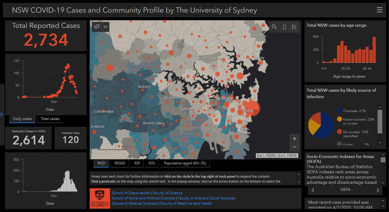
“Rather than forcing people to sift through numbers in tables, the map and dashboard immediately informs the community where new cases are cropping up in relation to their homes and their families and friends,” explains Jamie.
“NSW Health was really proactive in openly sharing granular postcode-level case data, but the average person doesn’t have the skills or time to make sense of it.
“We received emails from people who would wake up and check it every morning before they went to drop their kids at school or went to the shops.
“Having access to a visual map of key data not only provided important information but also gave people peace of mind.”
The research project also mapped COVID-19 case data against socioeconomic indexes across Sydney’s local government areas, to help authorities understand the impact of geographic and demographic factors on outbreaks.
“We wanted to see how higher or lower socio-economic areas would be affected,” says Jamie.
“From a public health perspective, agencies could use that information to look at prioritisation of resources.
Jamie believes this same technology could be used to manage Australia’s lagging vaccination program and assist with understanding vaccine availability and priority target groups not being reached.
“Going beyond just the first level of showing how many people have been vaccinated, a map-based dashboard could be used as a communicative tool to demonstrate availability across locations,” says Jamie.
“For the priority groups, there’s also accessibility issues. By mapping demographics and identifying patterns of low vaccination rates, decision-makers could look to improve accessibility or develop geographically targeted communications.
“With Sydney currently experiencing another outbreak, sharing data in this way could also help focus vaccine efforts where they’re needed most.”
Esri Australia’s National Business Manager, Lisa Dykes believes Jamie’s dashboard will provide enduring value for those living in NSW as well as across Australia.
“Crises don’t stop at city or state borders and in order to make the right decisions, government and community leaders need to see the full picture,” notes Ms Dykes.
“Jamie’s project exemplifies the spirit of the Esri Young Scholar Award, which encourages future leaders to deliver practical, data-driven solutions using spatial technology.
“As we look ahead, Jamie’s work will stand as a benchmark for the health sector and any agency looking to establish effective, far-reaching communication tools that make critical information easily accessible.”